Plotting routines
For ease-of-use, standard implementations for plotting spectra have been
implemented. Each HFSModel has a method to plot to an axis,
while both SumModel and LinkedModel call this
plotting routine for the underlying spectrum.
Overview plotting
Considering a HFSModel, the standard plotting routines finds
out where the peaks in the spectrum are located, and samples around this
area taking the FWHM into account. Take this toy example of a spectrum
on a constant background:
import satlas as s
import numpy as np
np.random.seed(0)

I = 1.0
J = [1.0, 2.0]

ABC = [1000, 500, 30, 400, 0, 0]
df = 0
scale = 10
background = [1]

model = s.HFSModel(I, J, ABC, df, background_params=background, scale=scale)
model.plot()
C:Anaconda3libsite-packagesIPythonhtml.py:14: ShimWarning: The IPython.html package has been deprecated. You should import from notebook instead. IPython.html.widgets has moved to ipywidgets.
  "IPython.html.widgets has moved to ipywidgets.", ShimWarning)
C:Anaconda3libsite-packagesmatplotlib__init__.py:872: UserWarning: axes.color_cycle is deprecated and replaced with axes.prop_cycle; please use the latter.
  warnings.warn(self.msg_depr % (key, alt_key))
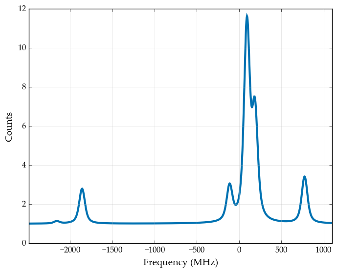
This provides a quick overview of the entire spectrum.
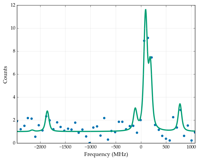
Plotting with data
When data is available, it can be plotted alongside the spectrum.
x = np.linspace(model.locations.min() - 300, model.locations.max() + 300, 50)
y = model(x) + 0.5*np.random.randn(x.size) * model(x)**0.5
y = np.where(y<0, 0, y)
model.plot(x=x, y=y)
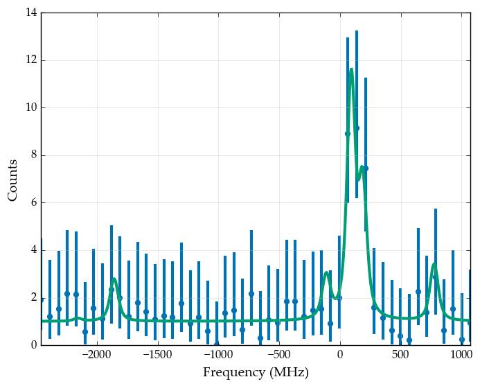
Errorbars can be plotted by either supplying them in the yerr keyword, or by using the plot_spectroscopic method. this method, instead of using the symmetric errorbars provided by calculating the square root of the data point, calculate the asymmetric 68% coverage of the Poisson distribution with the mean provided by the data point. Especially at lower statistics, this is evident by the fact that the errorbars do not cross below 0 counts.
model.plot_spectroscopic(x=x, y=y)
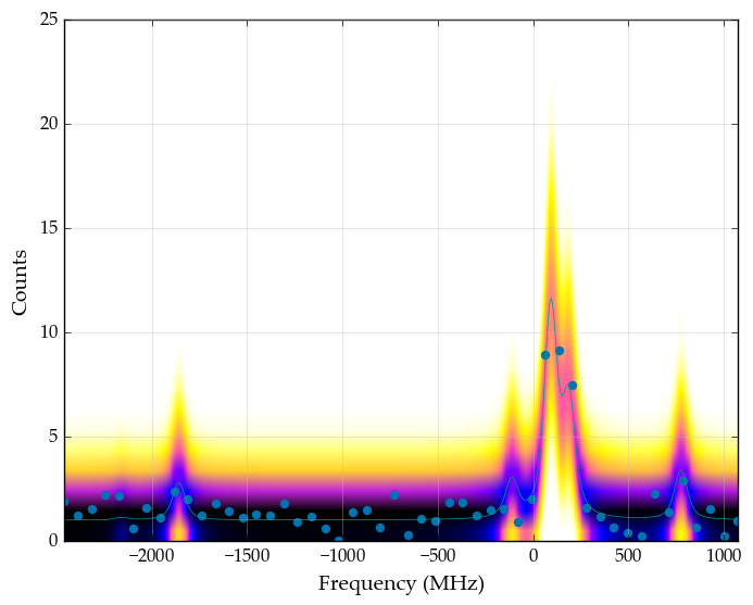
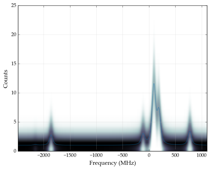
Uncertainty on model
The spectrum itself can also be displayed by showing the uncertainty on the model value, interpreting the model value as the mean of the corresponding Poisson distribution. The probability is then calculated on a 2D grid of points, and colored depending on the value of the Poisson pdf. A thin line is also drawn, representing the modelvalue and thus the mean of the distribution.
model.plot(model=True)
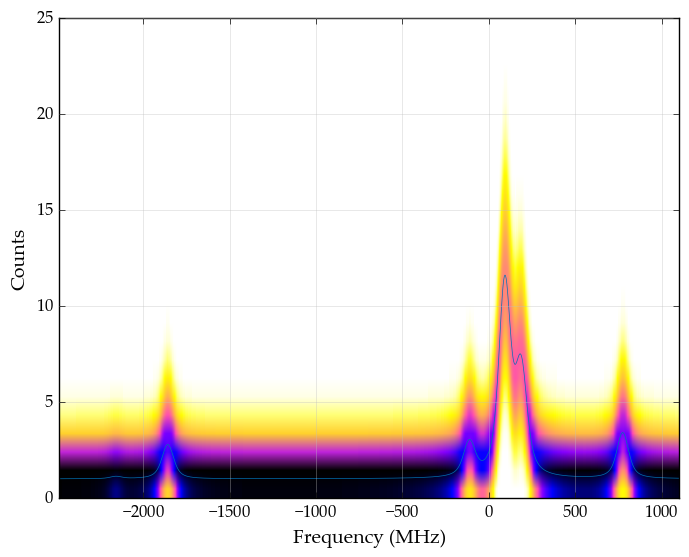
This plot can be displayed in each colormap provided by matplotlib by specifying the colormap as a string.
model.plot(model=True, colormap='gnuplot2_r')
model.plot(model=True, colormap='plasma')
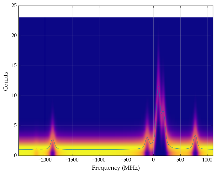
The data can also be plotted on top of this imagemap.
model.plot(x=x, y=y, model=True, colormap='gnuplot2_r')